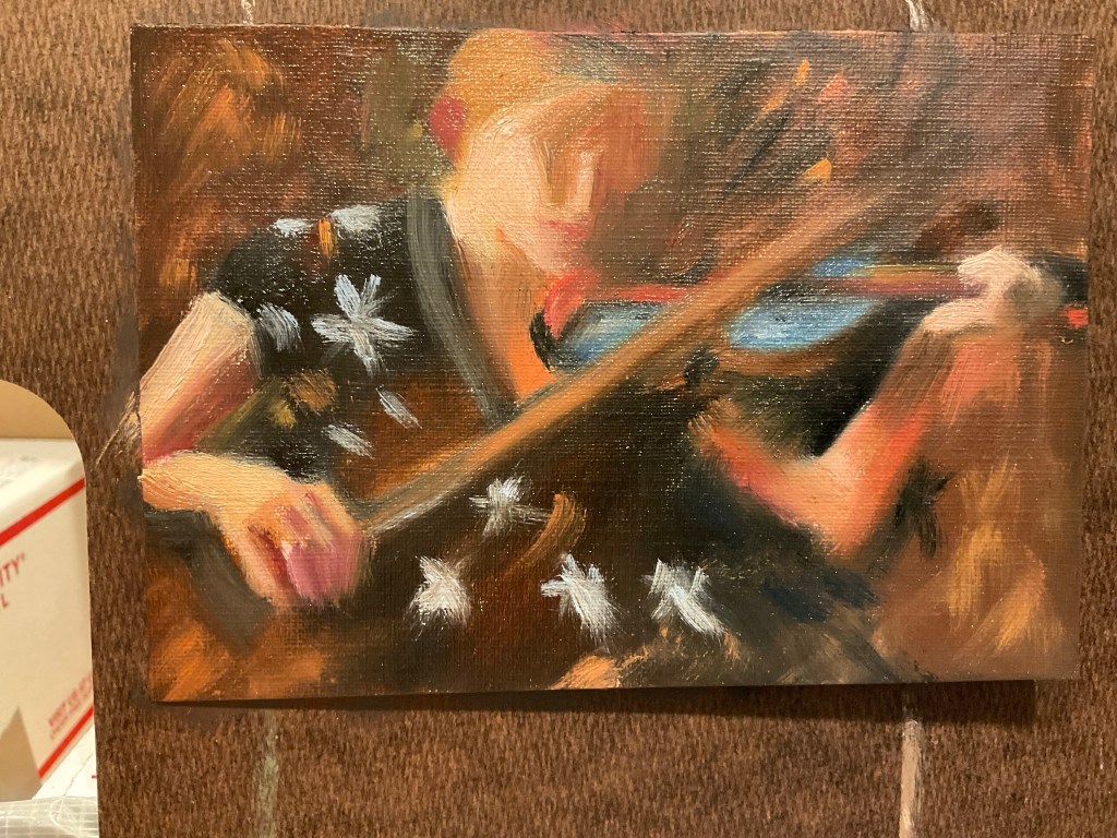
This painting was awarded First Place in Oil Painting at the Wabash Valley Art Guild Spring Show in May 2024.
I took the photo 3 weeks after she had been bitten in the face by a dog, in which she lost part of her lower lip and now had a significant scar down her chin. She was five at the time, and has been a real trooper about the ordeal.
I think the painting was my own therapy, to celebrate her continued beauty and character even after such an unpleasant event.
In April I went to the annual conference of the Portrait Society of America, this year in Atlanta, GA. I had a wonderful time!
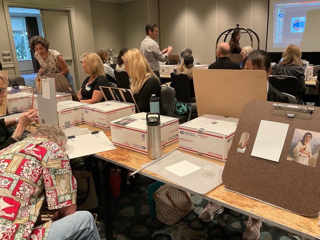
I took an all-day pre-conference workshop with Louis Carr, on preparing for painting by doing color studies. He was a great teacher, starting with a fascinating talk on human perception and the illusions of color.
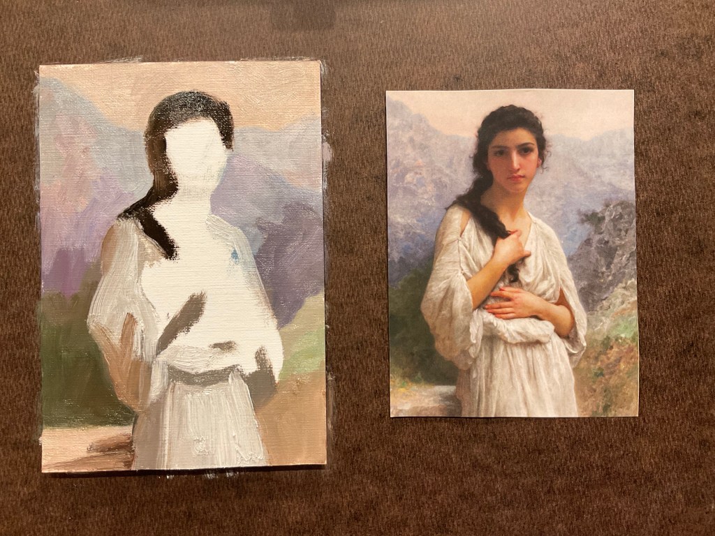
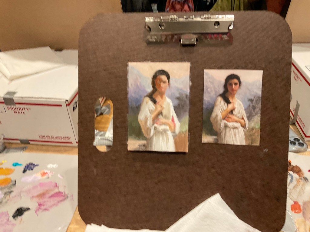
All 30 people in the class painted color studies under his direction, from small photos of other paintings, just trying to match their shapes and colors.
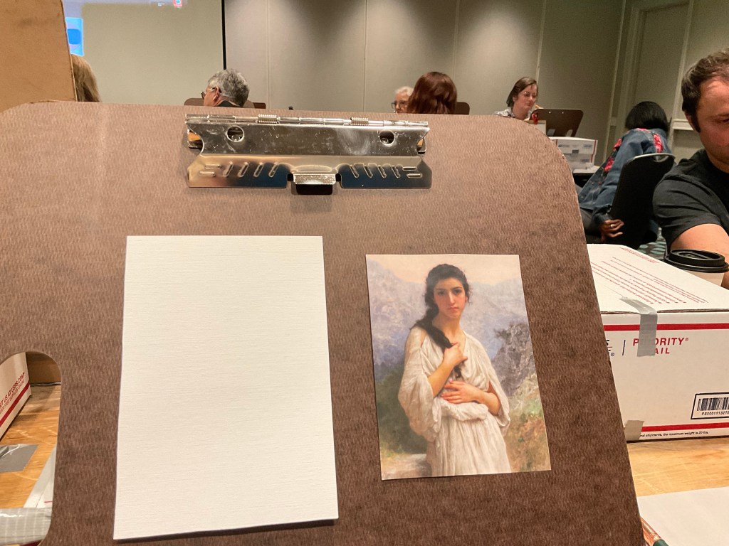
Louis telling us how to get set upMy space-carefully taped and securedWe each chose a print of a painting We placed the background firstColor study finishedSecond color studyWe REALLY tried to keep the mess to a minimumFinished studies-a great lesson.
(I wrote this post earlier this year, but then did not want to publish it, as my mum was declining. Now that she is gone, I feel I can honor her by publishing it. She liked the painting and had a print of it made and kept it in her kitchen).
I miss her. This painting brings me good memories.
Oil on Canvas Panel, 16 x 20 ins
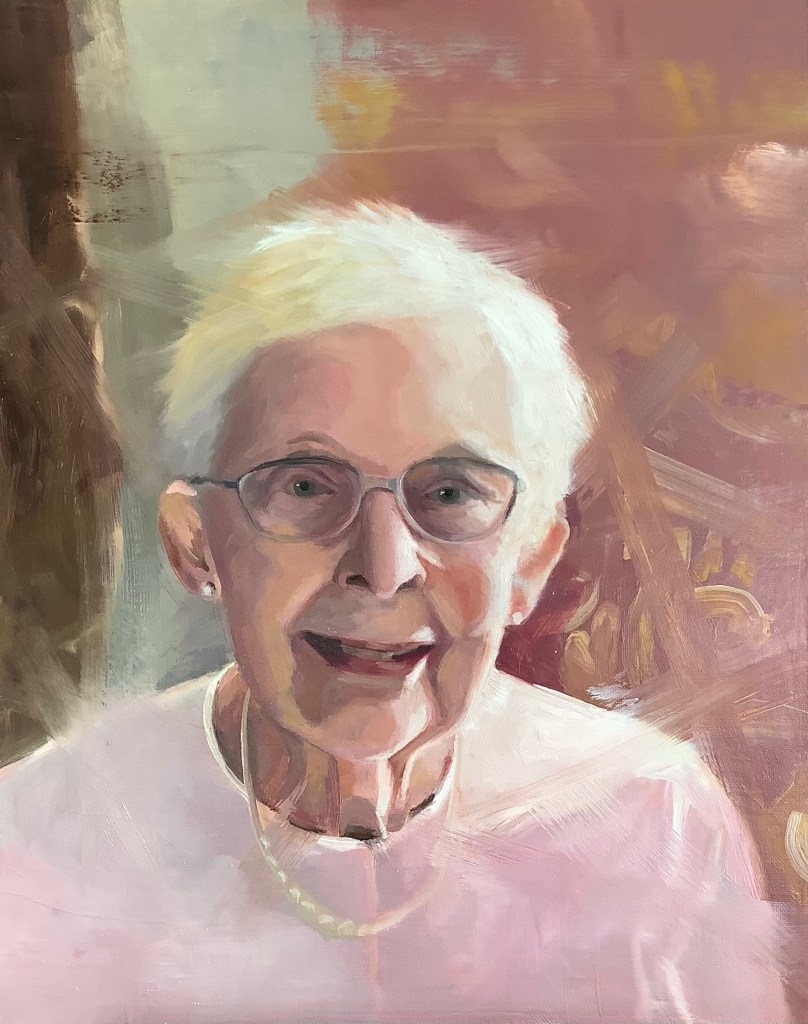
This is a painting of someone very dear to me. She was widowed at age 74, survived a lymphoma at age 79, and here in this painting at 86 is still living a brave, determined and out-ward focused life.
The painting won First Place in Oil Painting at the Wabash Valley Art Guild Spring Show this year.
(I wrote this a couple of months ago, but a lot of October and November has been taken up with the end of life of my mother. She has now passed away, and I’m attempting to return to my ‘usual’ practices).
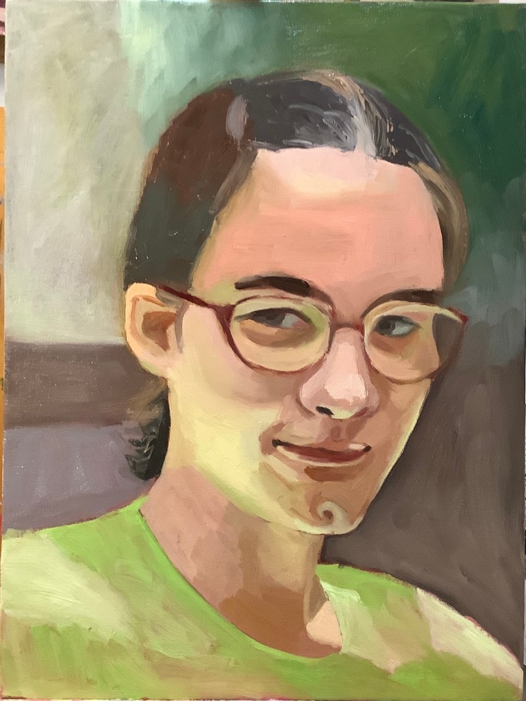
Following on from the Mastering Composition Course (Ian Roberts) which I took in January-March 2023, I then signed up for the Bold Brushwork Course (April-June). This was only open to people who had taken part in the Mastering Composition Course.
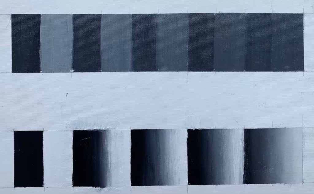
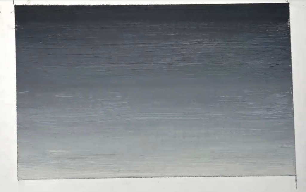
The first lessons and exercises were to practice value scales, edge scales and gradations in paint—(Ivory black and Titanium White). Most students used oil paint, although some used acrylic, watercolor, gouache, or pastel.
Then we painted compositions in black and white, concentrating on values, shapes, and edges, using a ‘Paint It and Leave it’ approach.
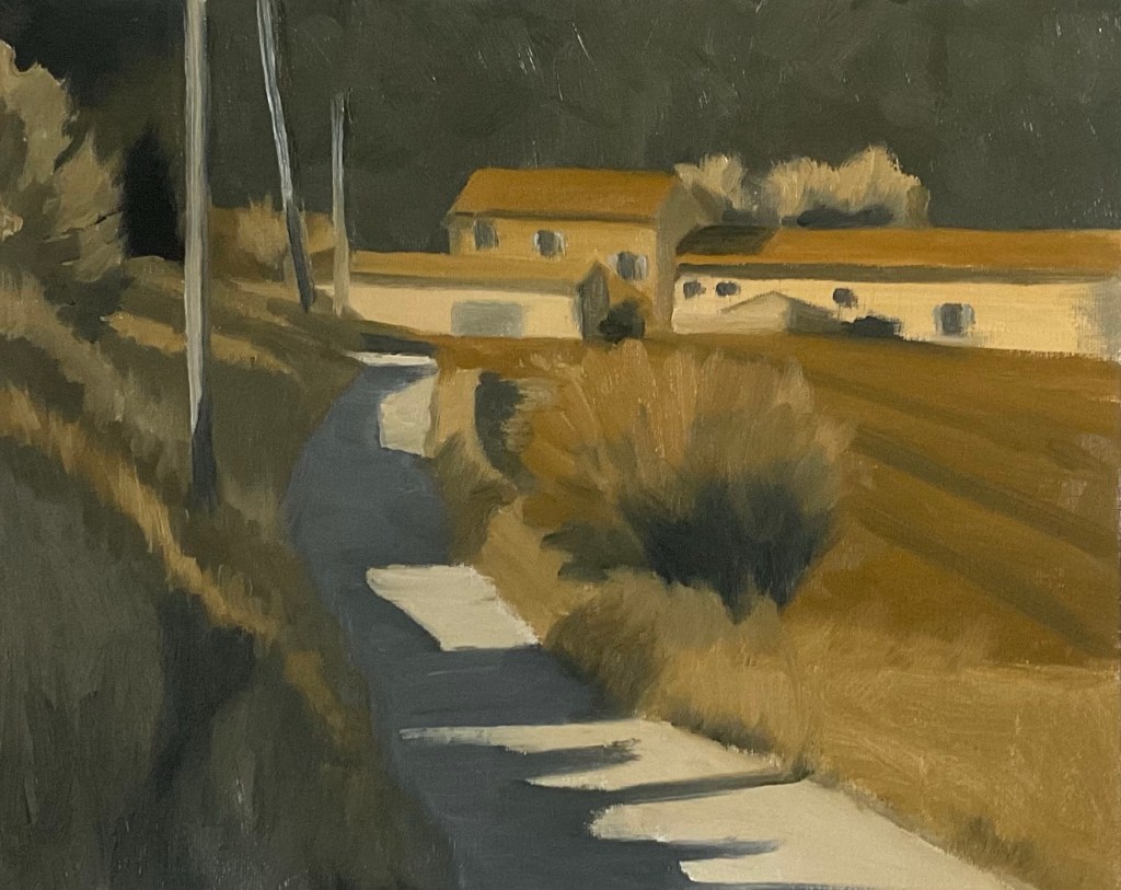
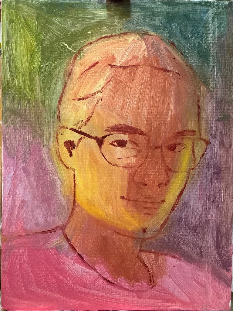
The next step was to consider color temperature, and to do this we added yellow ochre to the palette to indicate warm light, and used the ivory black to indicate cool light. (Our paintings were limited to warm light and cool shadow situations for the learning purpose).
In the final part of the course, we added an extra color dimension and used Ultramarine Blue, Cadmium Orange and Titanium White. Now there was more intensity to deal with, either to mute or to use in small amounts as an accent.
It was a very rewarding course. I felt I improved at putting on thick paint and ‘one touch’ brushstrokes, and gained a much better understanding of color temperature.
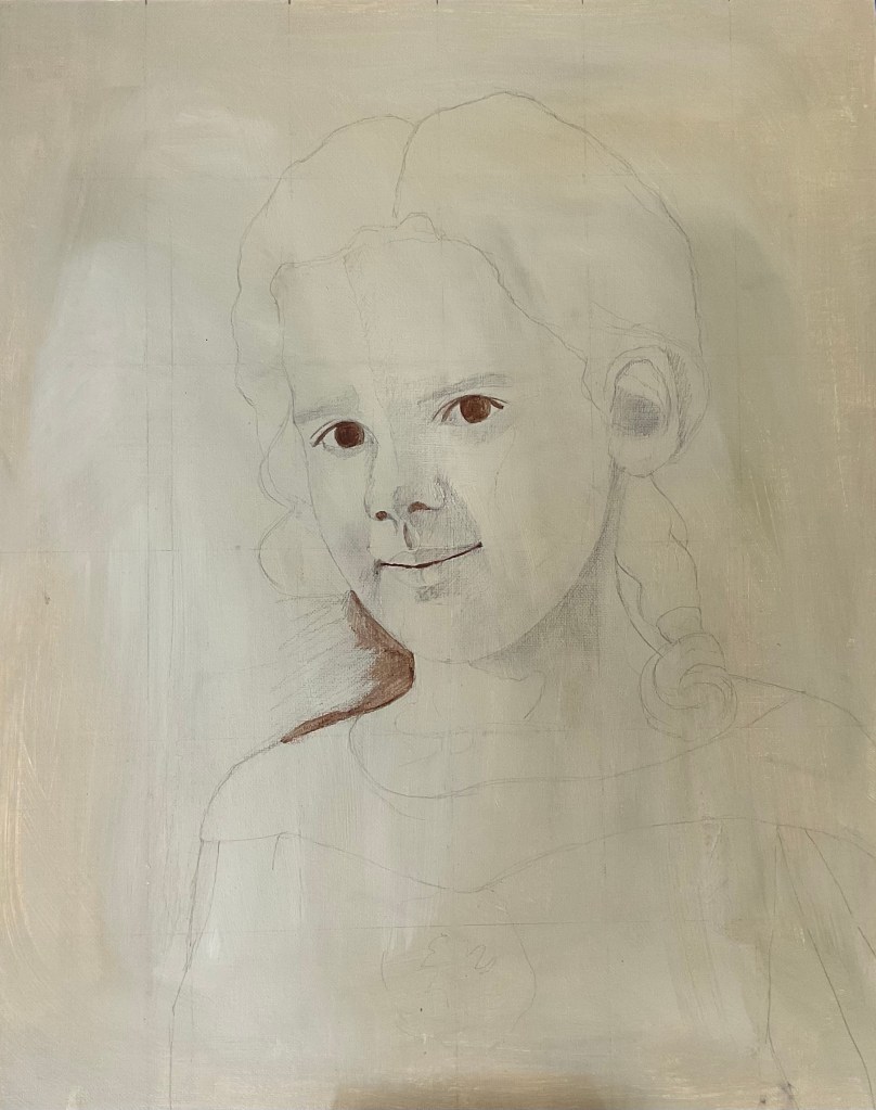
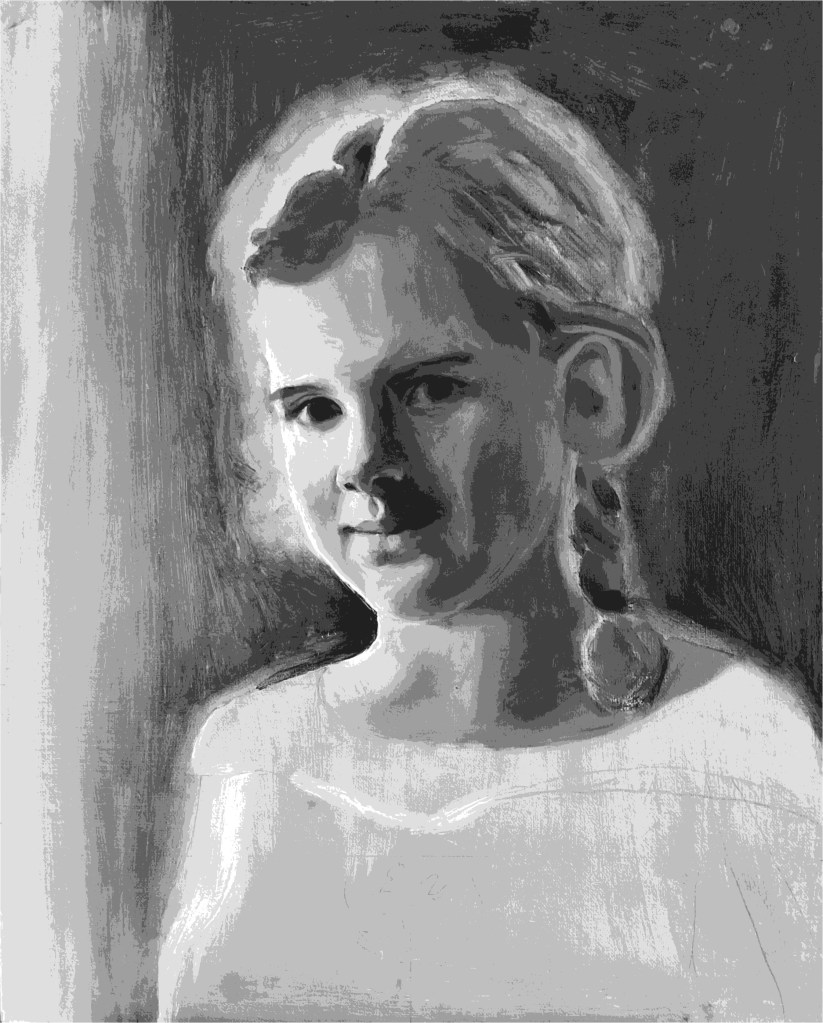
Oil on canvas panel, 16 x 20 insThe photo I took of her wearing the dress I bought for her.Full size pencil investigationSmall color studyPencil outline (fixed) on a toned canvasBistre underpainting—burnt umber and a lean mixture of mediumGrisaille underpainting (over the bistre)Section of the finished grisaille viewed through a values app.
After painting ‘Katherine in Grey’ I decided to try a full color painting using a grisaille underpainting. I bought an online class to help me—Oil Painting Portrait Glazing class by Will Kemp.
For all of the figure and dress I used two simple triads of colors—Mars Yellow, Chinese Vermillion, and Turquoise light, all by Sennelier, plus Ultramarine Blue, Burnt Umber and Titanium White by Geneva Fine Art.
I enjoyed the process of all the steps and layers. Maybe I’ll try it again!
After doing some underpaintings in Black and white (and gray!) I started this one of Katherine. I used an app called Value Study to get the basic idea. The background is a light layer of burnt sienna.
I was planning to paint color layers over it, but so many people said they like it as it is that I left it!
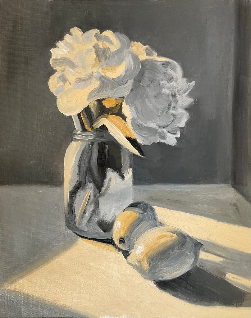
This Spring I had three paintings accepted for the ‘Spring’ (any interpretation) Show at the Arts Illiana Gallery. I was particularly happy that my painting ‘A Spring in Her Step’ was juried in.
This is a re-painting I did recently of an earlier painting which was in a smaller format. It is my mother and daughter striding out across the hills and fields while taking the dog for a walk.
Which one has the spring in her step?
Cara, Oil on gessoed MDF board, 9 x 12 ins.
I painted this, using my own photo, after watching lessons by Jane French on Domestika.
She uses a direct approach and a square brush technique. I like her paintings because she uses surprising colors on the skin tones, and yet from a distance they meld in beautifully.
I did not achieve the same colors in the skin tones here. That needs another attempt. I’m happy with the brushwork changes I made.
The picture reminds me of a happy conversation on a pleasant evening with friends.
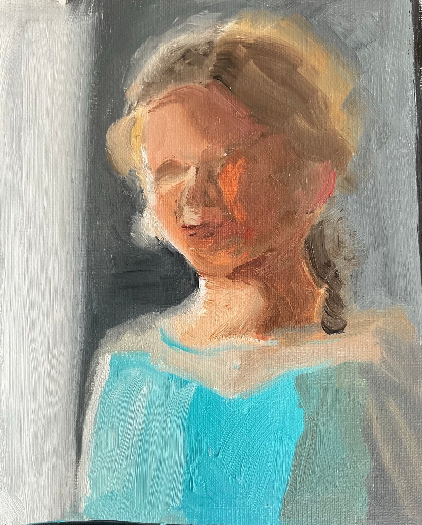
I painted this portrait of my daughter from a photo I took while we were sitting on our deck one sunny lunchtime. I was struck by the lovely green reflection of her shirt in her cheek and chin. It really seemed to jump up there!
Here are some of the steps I took in the painting:
The first layer and the motifAll colors and values blocked inMomentum addedStarted on refinements