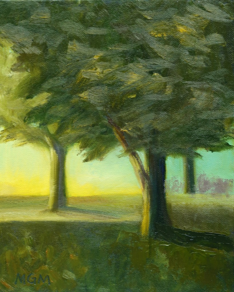
The painting above was developed from the thumbnails on the bottom half of the sketchbook page, 2c. I have the 3-value sketch on the left and then four Notan possibilities to the right. I chose the lower left one from which to paint.
I think that this time I kept to the value pattern more accurately, but I lost it a bit at the left end of the tree line—the values of sky/trees/field become too similar there. I like these colors better than my Composition I painting.
Mary Gilkerson was an artist and teacher from South Carolina, whose art and videos I have liked for a while. She painted colorful landscapes using a palette knife. Sadly she passed away in April 2022.
The people in charge of her estate decided to offer her video classes to the public on YouTube at no charge. Thank you!
I have been following her ‘Composition, Color and Light’ course and it has been extremely helpful in learning how to compose a landscape, and in fact a painting of any subject.
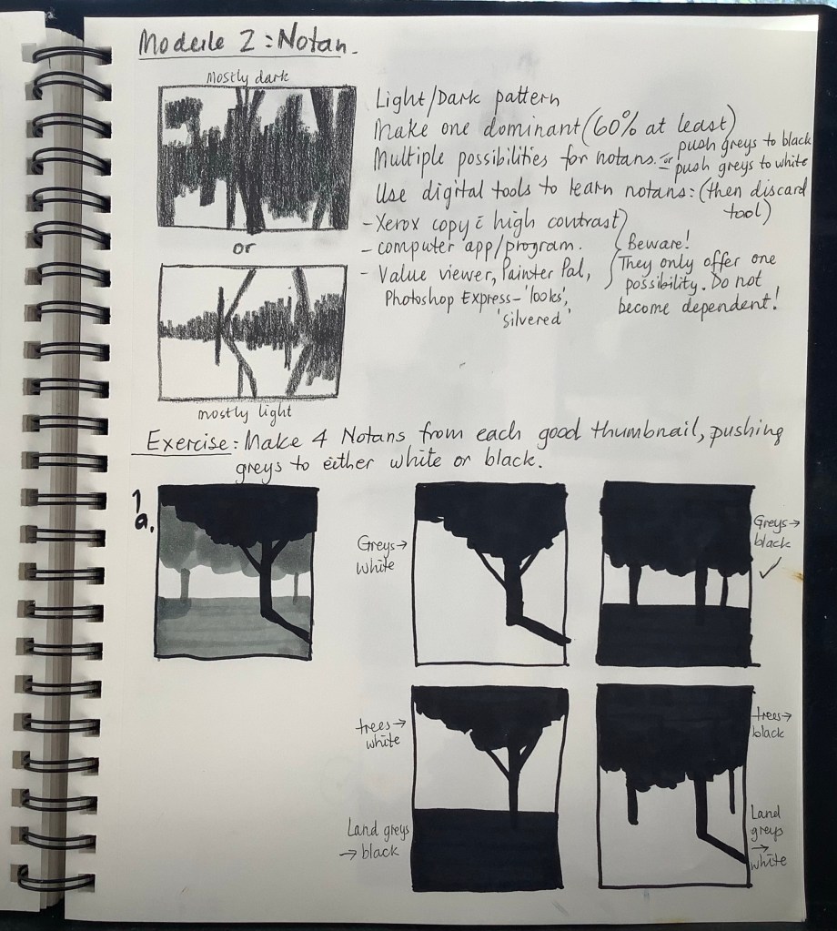
She makes the process of developing a Notan (black and white value pattern) from a photograph understandable in a way I’d never seen before:
1. Develop a 3-value study of the scene in question.
2. Make several thumbnail variations pushing the mid-value to either black or white.
3. Choose the one that is most pleasing to you as the value pattern for your painting.
Below is my sketchbook showing this process, and indicating the value pattern I chose. But then I didn’t keep exactly to it, and I used strange colors, so I was not entirely happy with the painting above. I have since practiced quite a bit more and have some better results—in future posts!
I had a painting like this in mind for several months, ever since I took the photo last fall of my granddaughter staring at parachute jumpers exiting an airplane. I liked the lighting on her, her position, and her look of interested wonder.
It seemed a fitting start for a painting for a group Show connected with our local library’s Fall Big Read–World Of Wonders, by Aimee Nezhukumatathil. The book is intended to increase people’s interest and wonder in the natural world. I read the book over the summer and appreciated many of the author’s thoughts and insights.
In my painting I made the object of her vision and wonder a Monarch butterfly, the subject of a chapter in the book. I enjoyed researching the butterfly and adding it to my painting.
The art display is up in the Terre Haute library for the month of August 2022.
I painted this picture of my youngest granddaughter from a photo taken and sent by my daughter-in-law. Besides loving the subject, I loved the light on her face. The photo was actually taken in their bathroom without the toys. I adjusted the background and requested a photo of the toys to add to the foreground.
This painting is currently on display at the Link Art Gallery in Paris, IL. I was delighted to find that my painting was chosen as the one used for the promotional cards for the Show. It will be up until July 15, 2022, along with other works by members of the River City Art Association, including two more of mine.
‘Future Promise’, Oil and glitter glue on canvas panel, 12 x 16 ins
As part of the annual Library Big Read program (by NEA and Arts Midwest) the River City Art Association provided a visual display of works related to the theme of the book. They are on display at the Vigo County Library.
I read the book in January, and chose to represent the passage where Denver describes her birth story to Beloved. There are several aspects I find beautiful about this story, one being that a white woman helped the escaping slave, Sethe, give birth to Denver (on a boat in the middle of the Ohio River), and it was ‘done appropriately and well’. Another inspiring aspect is the description of the blue and silver fern spores in the river, each one containing information for promise of the future.
The display will be up until Friday, April 1, 2022.
One of my major painting goals for 2022 is to paint from life as much as possible.
After my enjoyable sessions at the live portrait group in Pennsylvania, where I simplified the process by using only the Zorn palette (yellow ochre, cadmium red, ivory black and titanium white) plus transparent red oxide, I decided to concentrate on using the Zorn palette for more portrait practice this year.
I returned to photos that I took in Nov 2019, when I asked family members to sit for me for an hour at a time during the week of my birthday and I painted 11 x 14 portrait sketches using water-mixable oils:
11 x 14 oil on canvas panel, 2019Photo taken at end of sitting 2019
Now, in 2022, I’ve repainted from these photographs using a 3-step process:
I decided to apply the lessons I’d learned from the live portrait group to some work at home.
Sadly, I did not have a live model anymore (working on ideas to find some!), but I revisited the time when I did have live models sit for me, during my birthday week of 2019 (one of my birthday wishes).
This is the one hour painting (water mixable oils on green-toned 11 x 14 canvas), and the photo I took at the end of that sitting.
I started the 2022 session with a charcoal drawing from the photo above, 6 x 8 ins.
Then I painted two studies using the Zorn palette, plus Transparent Red Oxide. 6×8 ins each, oil on canvas
I used all that information and practice to paint this final portrait. 9 x 12 ins, oil on canvas board. I was pleased to see some progress over the last two years!
Here are the results of the second 2 hour session I attended. The model this time was a local veteran. He was a very patient and cheerful sitter!A photo of the model.
At the end of the session, the model inspected the various representations of himself, with generous comments to all!
The group plans to continue painting veterans every other week, and in Nov 2022 have a display of all the year’s portraits of veterans at the VA hospital. At that time each veteran may choose one portrait of themselves to keep. I thought that was a great plan!
Oil, 9 x 12
Several months later, I painted the same subject again (from my photo), on a larger canvas and with a more expressive background.
During our fall stay in PA, I went to a couple of two hour live portrait sessions at a local art center. On one occasion we painted a class member and on the other, a veteran. There were 6-8 artists present, using a variety of media.
On the first session I attended we painted a class member. I started in charcoal, and was pleased to find I could make a decent likeness in about half an hour.
Charcoal on toned gray paper, 5.5 x 8.5 in
Then I painted the sitter again using a very limited palette of oil paints. This was yellow ochre, cadmium red, ivory black, titanium white and transparent red oxide (a modifed version of the palette used by Swedish master artist Anders Zorn).
Oil Paint on canvas, 6 x 7.75 in
I started with a very rough block-in, then painted all the shadows with transparent red oxide for the face and ivory black for the clothing. I found the limited number of colors easier to manage and mix.
I was very happy with the glow that the red oxide gave to the face. The other class members had useful comments to make about my efforts and said I’d captured his likeness exactly. It was all very enjoyable and satisfying.