

Acrylic 9 x 12
This is the more finished tutu painting. I was pleased with the layers of tulle effect using the blades. It was fun to do!
Acrylic 9 x 12
This is the more finished tutu painting. I was pleased with the layers of tulle effect using the blades. It was fun to do!


I’m really enjoying experimenting with these great tools, especially the mini-blades with handles. They are like flexible palette knives and the feeling is very liberating. I can mix and scrape right on the canvas and create all sorts of effects that a brush would not do.
This small acrylic painting (6×8 in) is a study for a larger painting. My daughter was trying on her first real ballet outfit, twirling around the room, and caught sight of herself in the sliding glass door. Her pose caught my eye. What was going through her mind?
I loved how the blades made the tulle of the tutu. The rest of the study was done with brushes.
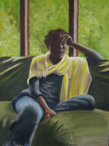
Oil 9 x 12
This young lady is the daughter of friends we knew a long time ago. She was born on Christmas Eve and we visited her and her parents in the hospital on Christmas Day. I had seen her very little since that visit at one day old.
Last summer, we were able to visit her family on our travels to the east coast. As we were there visiting, she arrived home from Israel, having also recently been a missionary/aid nurse in the temporary trauma hospitals in Syria. She sat in the beautiful summer light and told me about her experiences. I loved the peace and calm she exuded and the hope she was offering to hurting people, all of which seemed symbolized to me by the yellow shawl she was wearing. I’d wanted to paint her ever since then!
I painted this with an acrylic under-painting (full color) and then painted oils over that.
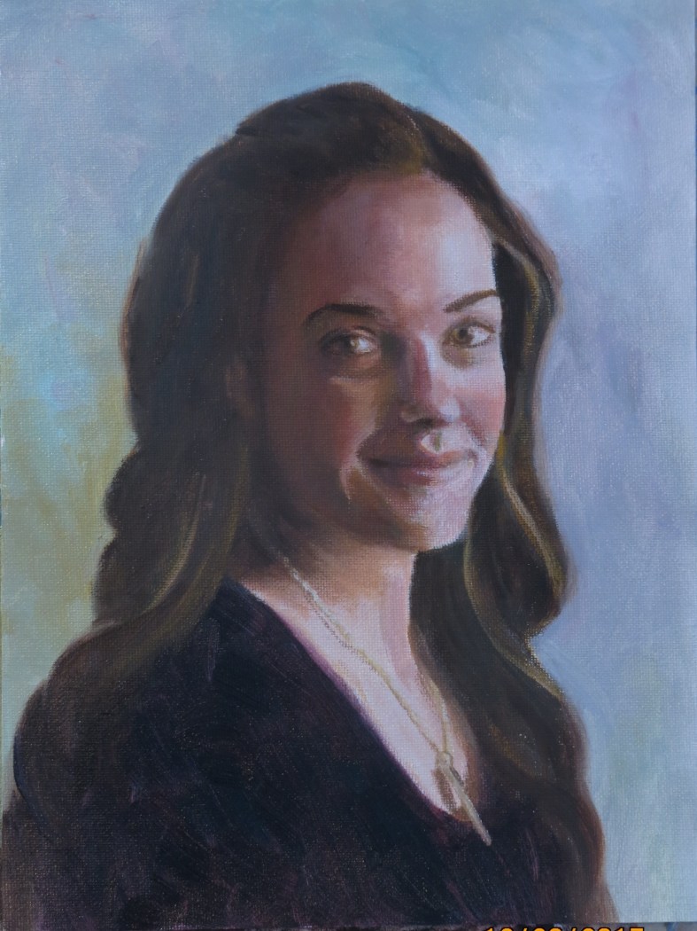
9 x 12 ins, canvas
In November I enlisted the help of this very gracious family member to help me follow the instructions of Brian Neher on the Craftsy video course ‘Painting Realistic Skin Tones in oil’.
We set her up near a North facing window, with a suitable background, and I took about 60 photos of her. Together we chose a few that we both liked and I settled on this pose.
The photo shows the colors a little incorrectly-the shadows are not quite that brown. However, I’m not satisfied with the shadow colors. I mixed cadmium red medium, yellow ochre, titanium white and a touch of viridian, aiming for grey, but the mix went more easily to a brown hue than a grey one. I need more practice and experimentation with this-does anyone have any tips?
I’m looking forward to trying the next one!

I used my daughter, Elizabeth as a model for this picture, taking about 30 pictures in various poses and lightings. When I decided which pose I liked I drew several on 6 x 8 inch pieces of 300 lb Arches paper and tried out a few different paint triads. It was fun! They all behaved differently, and there were quite a few surprise features. This image was my favorite, especially the blends and ‘holes’ in the background. The hair was added with burnt umber.
I printed the words on my computer, cut out the strips and attached them to the edge of the painting. I had copies made at Staples, where I always enjoy attentive and caring service. The staff there always seem willing to try several iterations until I’m satisfied with the product.
Merry Christmas and Happy New Year!

Acrylic, 9 x 12
This week I found out that this painting won second place in a local juried show! The entries for this show had to be on a ‘serene, inspirational or uplifting theme’. I was away in England for the whole show and so did not find out the result until my husband went to collect the paintings. What a lovely surprise!
A write -up on the whole show can be seen at www.rivercityart.org

Acrylic on hardboard, 6 x 8 in
This was from a photo that my daughter-in-law posted online. I loved everything about it, so asked permission (granted) to paint it. I love the light on Lois and on the river, giving her such beautiful golden hair and the river such wonderful green hues. I love her pose and the shadow it forms. What did she stop to look at and what is she thinking?


Acrylic, 6 x 6 inches
I recently tried these two pictures of baby hands with an orange using two different colored grounds. One was burnt sienna; the other was ultramarine blue. Can you tell which was which?
It’s not difficult to tell–the orange is more vibrant on the burnt sienna, and the rest of the painting is more exciting on the blue background. I found the flesh colors difficult to get correct. I like the top hand on the right the best, as it has the most luminosity.
I think hands are fascinating for their complexity of positions and expressions. I need more practice at painting them though!

Acrylic, 9 x 12 inches
I painted this picture as a gift for my son who has just learnt to skydive this year. He’s completed 26 jumps and graduated with his first certificate. We thought it was a crazy venture at first, but since he’s described the process we’ve been very impressed with the method and responsibility of the process and we’re proud of him.
I watched his you-tube video many times, stopping it every few seconds to find a shot I liked and then I painted from the computer screen.

This is my second adventure in acrylics, a painting of my granddaughter, Lois. I think the acrylic quick drying property makes me work looser and ‘rougher’. There is not so much time to adjust and fiddle! I’ve added layers of course, but the smooth gradations that are easy in oil are difficult here.
I love the vibrancy of the colors.
