This continued to be an informative and valuable course. I found the instruction and the feedback to be excellent.
Week 4 was some work on 2 value heads:

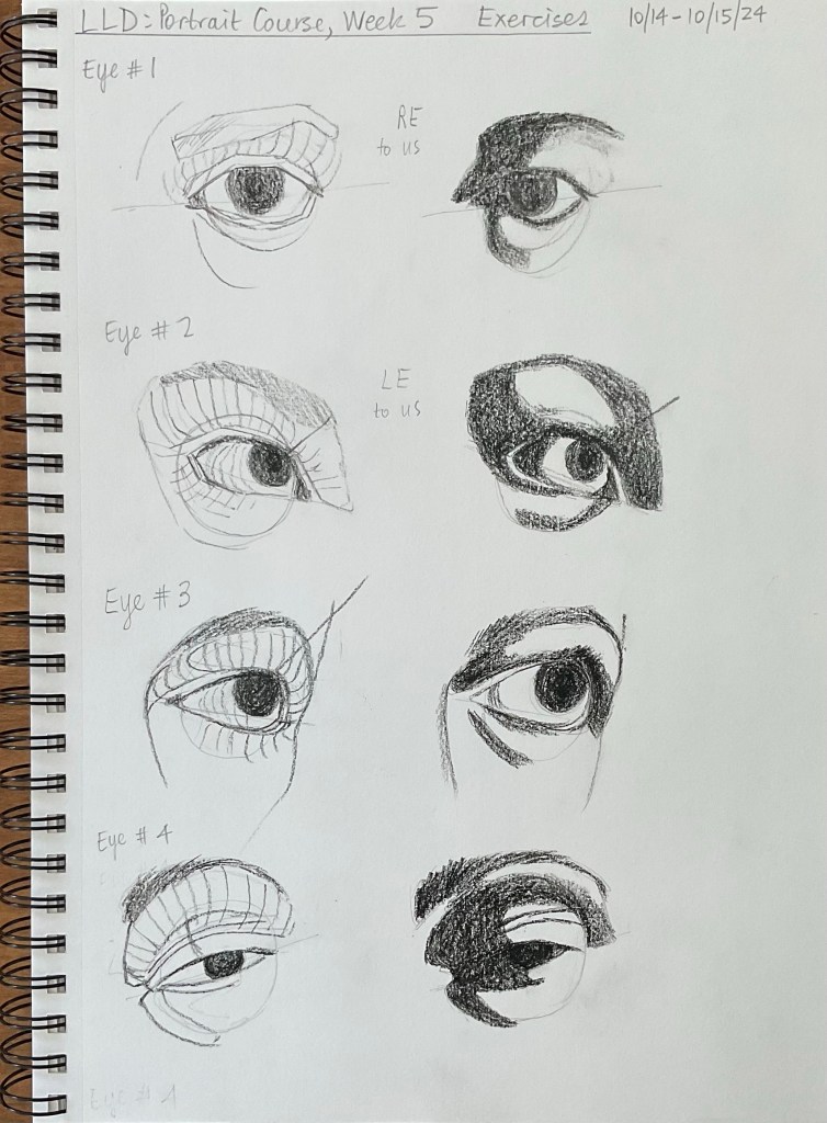
Then some work on Eyes in week 5:

This continued to be an informative and valuable course. I found the instruction and the feedback to be excellent.
Week 4 was some work on 2 value heads:
Then some work on Eyes in week 5:
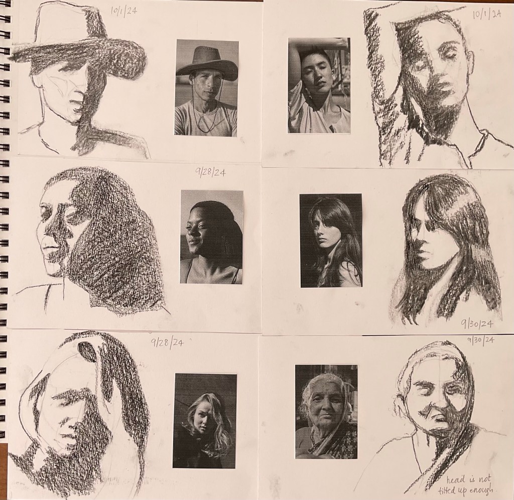
After learning to see and construct the head and facial structure we moved on to drawing the shapes in two values, still using basic shapes, no features yet.


I liked the lower left design best, so I chose that for my painting.
I applied the paint with a palette knife throughout. I like the sunlight effect in the lower half of the painting.

8 x 10 ins, oil on canvas board
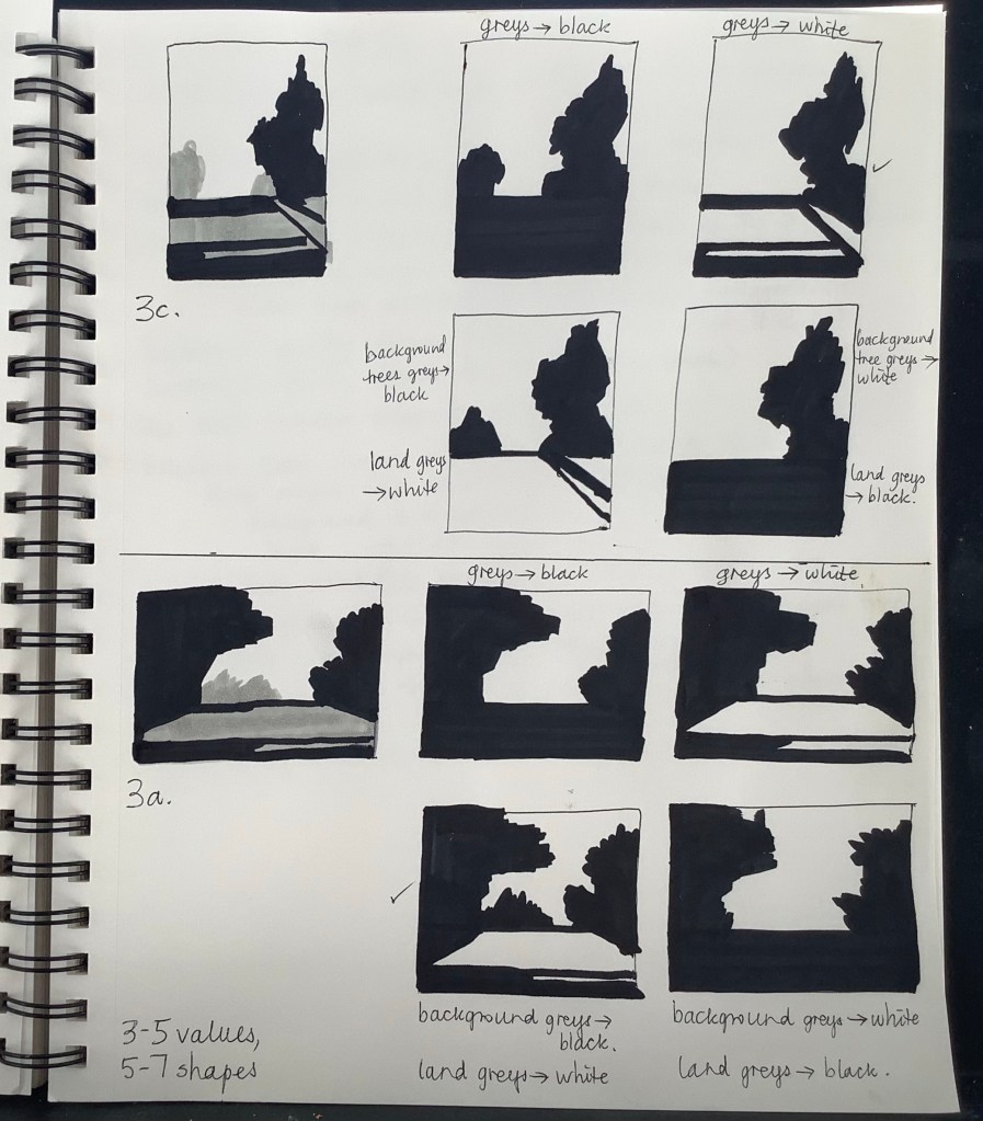
This painting was painted from 3a, the lower half of the sketch book page. I liked the lower left Notan the best and so used that for my guide. I used palette knives again throughout this one, as for Composition 3.

I painted it entirely with a palette knife.


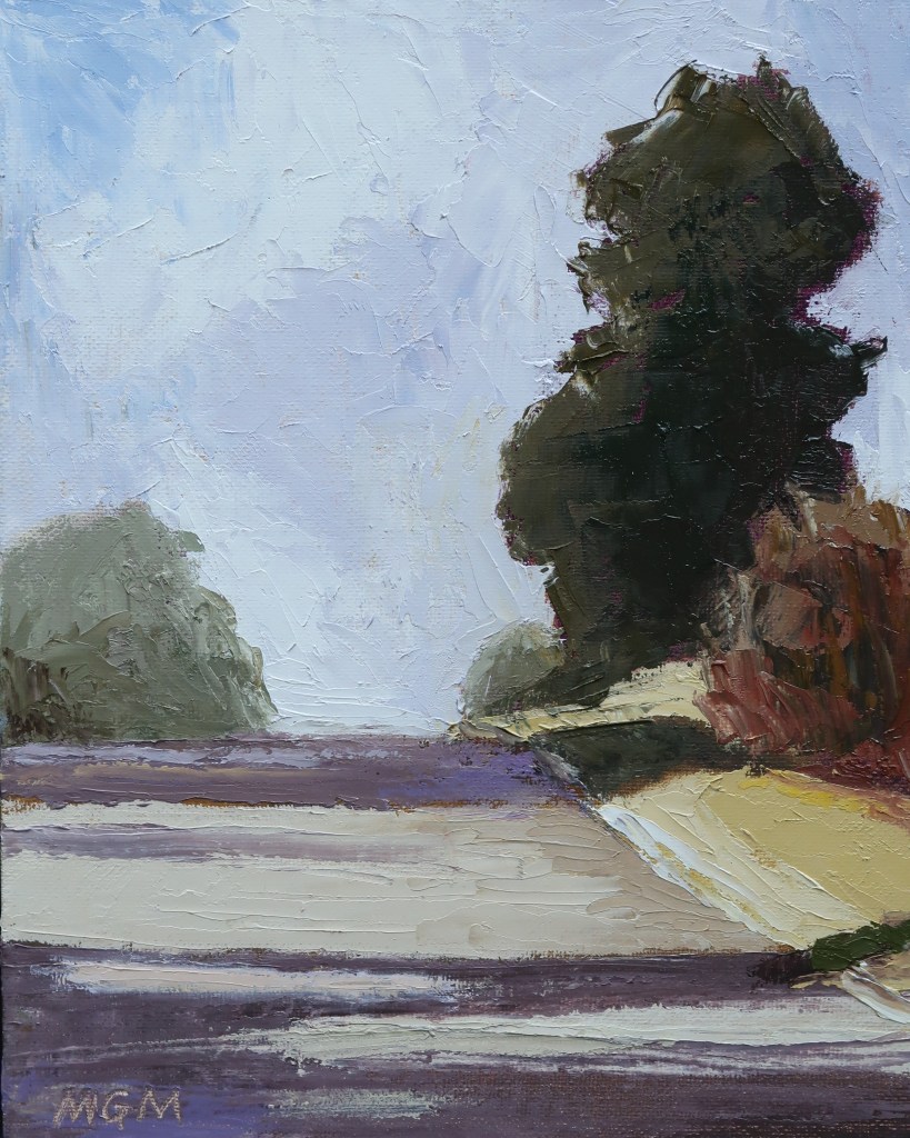
8 x 10 ins, oil on canvas board

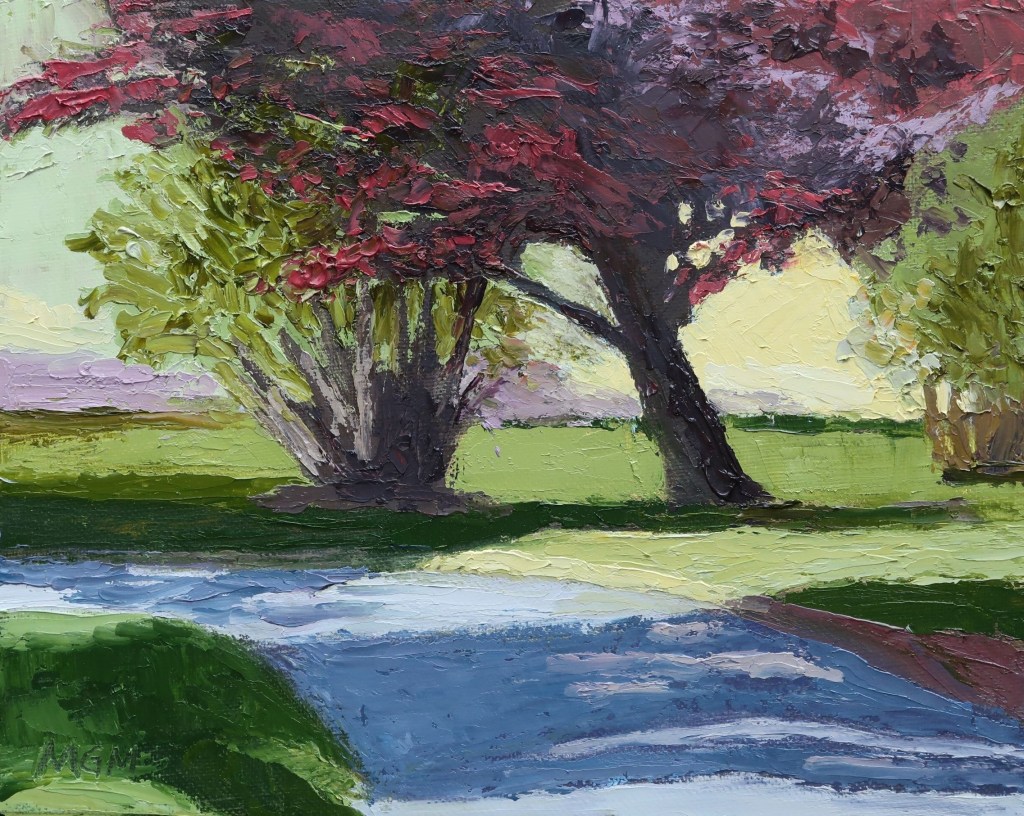
This painting was developed from the notan on the top half of the sketch book page, 3c. I used the value pattern on the top right, although the tree/bush at the left side of the road really ended up being a dark shape. I thought it looked a better balance as I was painting.
This time I painted entirely with a palette knife. I enjoy the thick and expressive paint!

8 x 10 ins, oil on canvas board

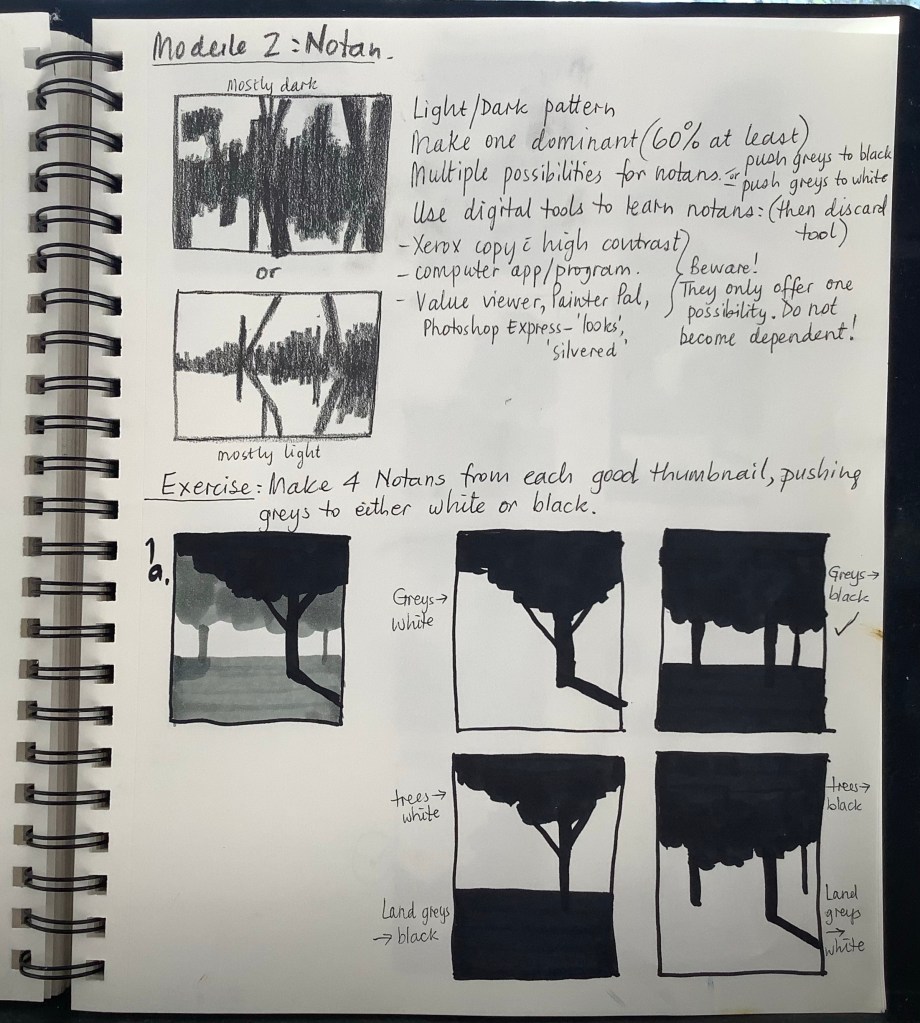
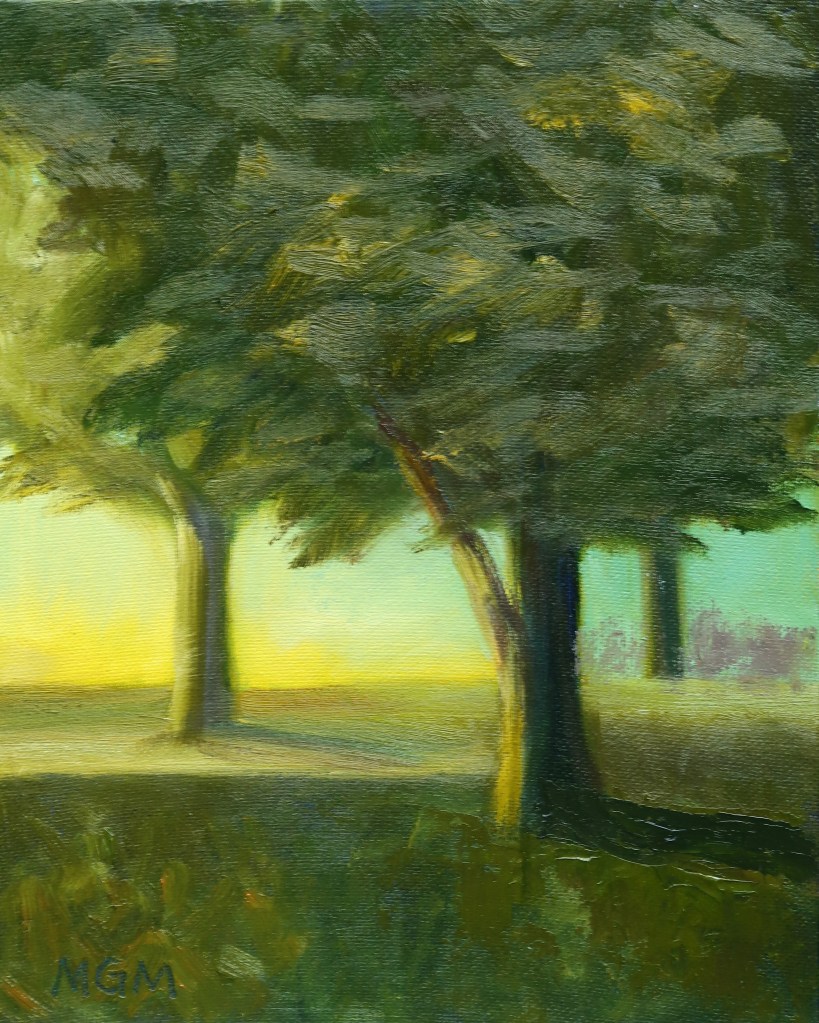
The painting above was developed from the thumbnails on the bottom half of the sketchbook page, 2c. I have the 3-value sketch on the left and then four Notan possibilities to the right. I chose the lower left one from which to paint.
I think that this time I kept to the value pattern more accurately, but I lost it a bit at the left end of the tree line—the values of sky/trees/field become too similar there. I like these colors better than my Composition I painting.
Mary Gilkerson was an artist and teacher from South Carolina, whose art and videos I have liked for a while. She painted colorful landscapes using a palette knife. Sadly she passed away in April 2022.
The people in charge of her estate decided to offer her video classes to the public on YouTube at no charge. Thank you!
I have been following her ‘Composition, Color and Light’ course and it has been extremely helpful in learning how to compose a landscape, and in fact a painting of any subject.
She makes the process of developing a Notan (black and white value pattern) from a photograph understandable in a way I’d never seen before:
1. Develop a 3-value study of the scene in question.
2. Make several thumbnail variations pushing the mid-value to either black or white.
3. Choose the one that is most pleasing to you as the value pattern for your painting.
Below is my sketchbook showing this process, and indicating the value pattern I chose. But then I didn’t keep exactly to it, and I used strange colors, so I was not entirely happy with the painting above. I have since practiced quite a bit more and have some better results—in future posts!