

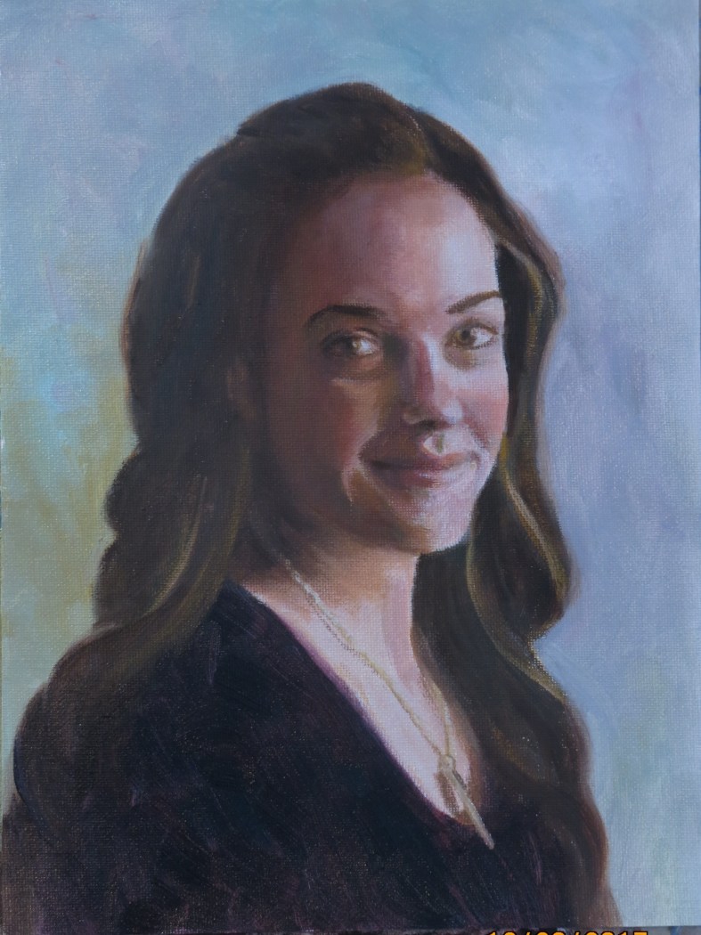
A Grandaughter, oil, 9 x 8 ins
I painted this one with an acrylic underpainting (full color) and then oils on top. I used a color isolator to see each color accurately. I like the result and am happy with her expression and the overall result!
A Grandaughter, oil, 9 x 8 ins
I painted this one with an acrylic underpainting (full color) and then oils on top. I used a color isolator to see each color accurately. I like the result and am happy with her expression and the overall result!
9 x 12 ins, canvas
In November I enlisted the help of this very gracious family member to help me follow the instructions of Brian Neher on the Craftsy video course ‘Painting Realistic Skin Tones in oil’.
We set her up near a North facing window, with a suitable background, and I took about 60 photos of her. Together we chose a few that we both liked and I settled on this pose.
The photo shows the colors a little incorrectly-the shadows are not quite that brown. However, I’m not satisfied with the shadow colors. I mixed cadmium red medium, yellow ochre, titanium white and a touch of viridian, aiming for grey, but the mix went more easily to a brown hue than a grey one. I need more practice and experimentation with this-does anyone have any tips?
I’m looking forward to trying the next one!

I used my daughter, Elizabeth as a model for this picture, taking about 30 pictures in various poses and lightings. When I decided which pose I liked I drew several on 6 x 8 inch pieces of 300 lb Arches paper and tried out a few different paint triads. It was fun! They all behaved differently, and there were quite a few surprise features. This image was my favorite, especially the blends and ‘holes’ in the background. The hair was added with burnt umber.
I printed the words on my computer, cut out the strips and attached them to the edge of the painting. I had copies made at Staples, where I always enjoy attentive and caring service. The staff there always seem willing to try several iterations until I’m satisfied with the product.
Merry Christmas and Happy New Year!

Acrylic, 9 x 12
This week I found out that this painting won second place in a local juried show! The entries for this show had to be on a ‘serene, inspirational or uplifting theme’. I was away in England for the whole show and so did not find out the result until my husband went to collect the paintings. What a lovely surprise!
A write -up on the whole show can be seen at www.rivercityart.org


These are some of the last paintings from 50 Small Paintings in Acrylics, by Mark Nelson. It was a very good way of becoming familiar with acrylics. I discovered that I like Golden Open acrylics the best. Now I am using the book to teach a group of children. They love the projects!
Saturday 21 Oct was Bloomington Open Studios Tour and I spent an invigorating couple of hours visiting three local artists (painters). I was especially impressed by Dawn Adams www.DawnAdamsPaintings.com and Meg Lagodzki www.meglagodzki-art.com
It was inspiring to see their working spaces, to talk to them about their history, processes and results.
Dawn Adams uses multiple thin layers of oil paint to acheive marvelously luminous landscapes and seascapes. That was very interesting to me, as I’m currently reading Glazing by Michael Wilcox
which I have on interlibrary loan. This method takes a long time and a lot of patience. I wonder what effects I could obtain with transparent acrylics?
Meg Lagodzki also paints in oils and had a very interesting series on local quarries, which seemed to me an unlikely subject, but she had created many beautiful paintings with fascinating shapes and colors, reinforcing the idea to me that beauty can be found in unlikely areas if you know how to look at it and interpret it.

Acrylic on hardboard, 6 x 8 in
This was from a photo that my daughter-in-law posted online. I loved everything about it, so asked permission (granted) to paint it. I love the light on Lois and on the river, giving her such beautiful golden hair and the river such wonderful green hues. I love her pose and the shadow it forms. What did she stop to look at and what is she thinking?

Acrylic on hardboard, 6x 6 ins
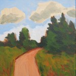
This time I really sat outside–on my deck, looking out at my backyard, early on Saturday morning. I really wanted to paint the sunlight coming through the trees and tried to make this a ‘response painting’ rather than an accurate representation. It became more accurate than I intended, but I like the effect. At least I put something down on the board before the sun moved above the trees!
These paintings were all done from the front seat of my van. Is it ‘plein air’ if the window is closed? (I think the window might have been open though! We have had weeks of gloriously clear, sunny, warm weather) It seems the important aspect is to be looking at the real object in its real life setting. The first one is on the Indiana University campus in Bloomington, IN. It took me about 30 minutes.
Acrylic on hardboard, 6 x 6 inches
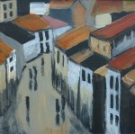
The second painting is also on the IU campus, done on a different day. I loved the morning shadows on the building, but feel I didn’t paint them quite how I wanted.
Acrylic on hardboard, 6 x 6 inches
I tried again the next week, using watercolor in my art journal. I like this one better. I think it was helpful to include the big tree that is casting the shadows on the building. Perhaps I was better at drawing it the second time. Perhaps the vertical format is more suitable? Total absorption for one beautiful hour!
Watercolor on Arches 90lb paper, 3.5 x 4.5 inches


Acrylic on gessoed hardboard, 6 x 6 in
My second attempt! On this occasion our family went to a local park and the other members played disc golf while I painted, from a picnic table.
I was experimenting with using a palette or painting knife. It was fun and rather freeing! It brings different expectations. I also really enjoyed scraping out with the knife.
At first I tried to capture the sun setting behind the trees, casting lovely shadows and golden patterns on the grass. Then I tried to paint the sunset before it disappeared. It really seemed to be moving fast!
I like the sky painting better. It seems almost abstract and yet I know what it is.
(I should not have left the date setting on on my camera! I know now to remember to remove it for paintings.)
