Sleeping 1, caught unawares


img_0033 crop

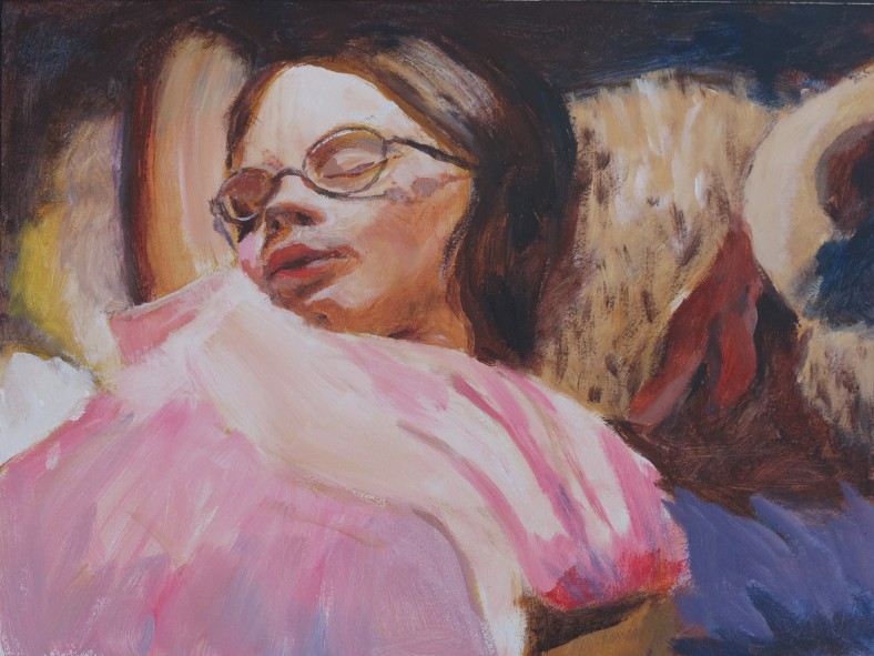
9 x 12, acrylic on board

This is a one hour study from a photo. I love sleeping pictures because they are so unposed and the person is very relaxed. This daughter, though, thinks that it’s unfair to catch her without her knowledge, and I can understand her feeling of vulnerability. However, I still like sleeping pictures.

It was fun to see it come together as I placed the colors and values. I concentrated on her face; if I’d allowed myself more time, I would have changed the shadow on her arm, and worked on the fabric of her dress a bit more.


Oxford I

Acrylic on canvas paper, 9 x 12

This is another boating picture, this time in a punt on the River Cherwell in Oxford, England, from the summer of 2018.

I toned the canvas with Cadmium Red and Cadmium Yellow Medium, using my blade to spread it. I like to leave areas of it showing through, as in parts of the boat.

It’s such a peaceful activity in a very beautiful city.

img_0032 crop

Oil, 9 x 12

Then I tried another version in oils, again with the same acrylic red and yellow underpainting. I like some of the effects, but the faces are indistinct, and the oils seemed to become too thick. I have more to try yet!


Rest Stop

IMG_0025

Acrylic, 9 x 12

I love painting trees and water with the Princeton Catalyst blades! Again, here I like the contrast of the bright colors of the kayaks and clothing with the peaceful setting of Racoon Lake, Indiana.

Kayak Adventures

IMG_0019

Acrylic, 9 x 12

Our family took up kayaking seven years ago, when looking for an accessible and fun family water sport. We have loved being out on the water, in many varied locations. It is usually very peaceful and restorative.

For a long time I’ve wanted to paint the juxtapositon of the brightly colored kayaks and the peaceful settings. I’ve tried before, but never seemed to hit the right feeling. Using the Princeton Catalyst blades with acrylics on an orange ground seems to get much closer to the feeling I’ve wanted.

This was from a trip this summer to Lake Monroe, Indiana. We had a dear friend visiting from California and we took him kayaking for the first time in his 78 years! He thoroughly enjoyed it.

Summer Triads

IMG_0296

Red Treasure, Acrylic 9 x 12

Now I’m adding a time limit (guideline!) to my triad limit. I’m trying to keep each painting time to around an hour—challenging! This triad is Cadmium Yellow Medium, Cadmium Red Medium and Ultramarine Blue (plus Titanium White).

I decided to try the skin tones in the same acrylic colors, and I was using one of my larger brushes to try and capture the big tones and not fuss with the detail. I was pretty excited that I actually could paint as loosely as this!

More blades!

IMG_0014

Flying! Acrylic and oil, 9×12

This time I used the Catalyst Blade for the background and the skirt. It was great fun!

I’m trying to limit myself to simple triads of colors this summer. This one is Cadmium Yellow Medium, Cadmium Red Medium and Ultramarine Blue (plus Titanium White, but I think of that as a constant necessity, not part of the triad).

I used oils for the skin, changing the cadmium yellow medium for yellow ochre.

I used a photograph of my granddaughter at a fast food restaurant play place as the basis for this painting. I love the wildly mixed colors, which feel to me like the energy, noise and sometimes chaos, of these play places.


Wedges and Blades

I’m really enjoying experimenting with these great tools, especially the mini-blades with handles. They are like flexible palette knives and the feeling is very liberating. I can mix and scrape right on the canvas and create all sorts of effects that a brush would not do.

This small acrylic painting (6×8 in) is a study for a larger painting. My daughter was trying on her first real ballet outfit, twirling around the room, and caught sight of herself in the sliding glass door. Her pose caught my eye.  What was going through her mind?

I loved how the blades made the tulle of the tutu. The rest of the study was done with brushes.

Skin tones in oil

IMG_0256 (2)

9 x 12 ins, canvas

In November I enlisted the help of this very gracious family member to help me follow the instructions of Brian Neher on the Craftsy video course ‘Painting Realistic Skin Tones in oil’.

We set her up near a North facing window, with a suitable background, and I took about 60 photos of her. Together we chose a few that we both liked and I settled on this pose.

The photo shows the colors a little incorrectly-the shadows are not quite that brown. However, I’m not satisfied with the shadow colors. I mixed cadmium red medium, yellow ochre, titanium white and a touch of viridian, aiming for grey, but the mix went more easily to a brown hue than a grey one. I need more practice and experimentation with this-does anyone have any tips?

I’m looking forward to trying the next one!