Portrait Lesson IV

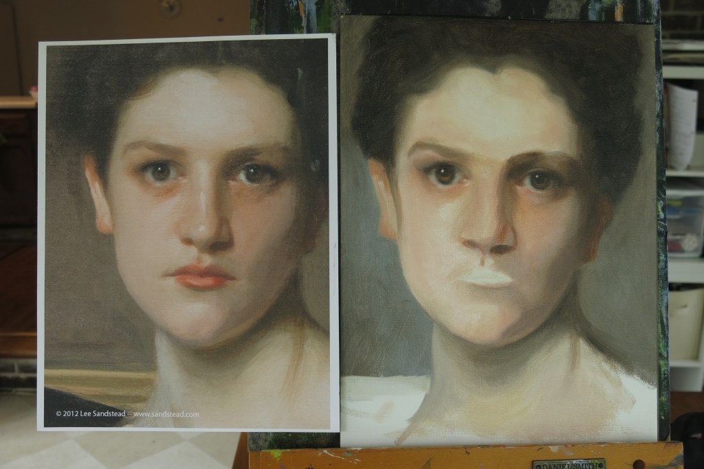
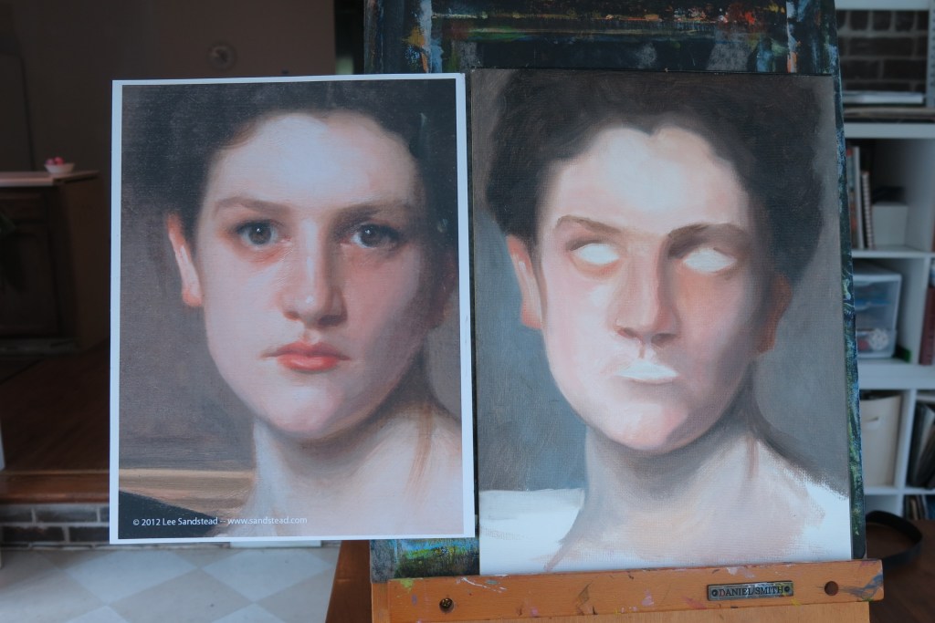
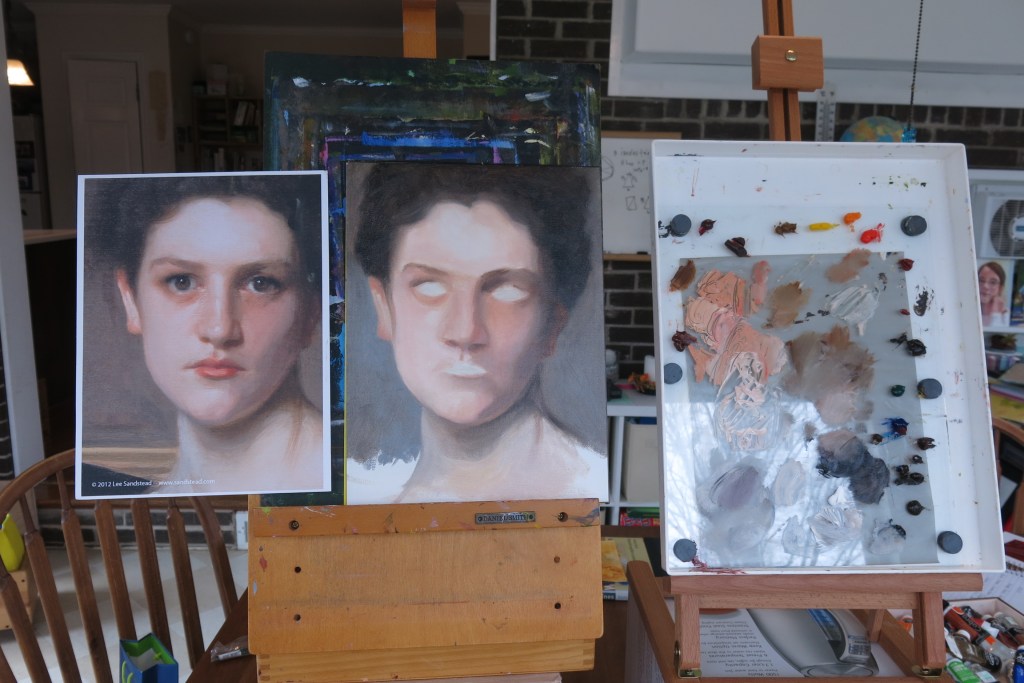
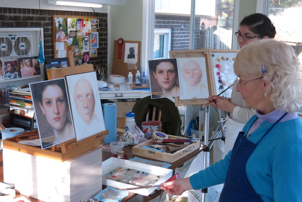
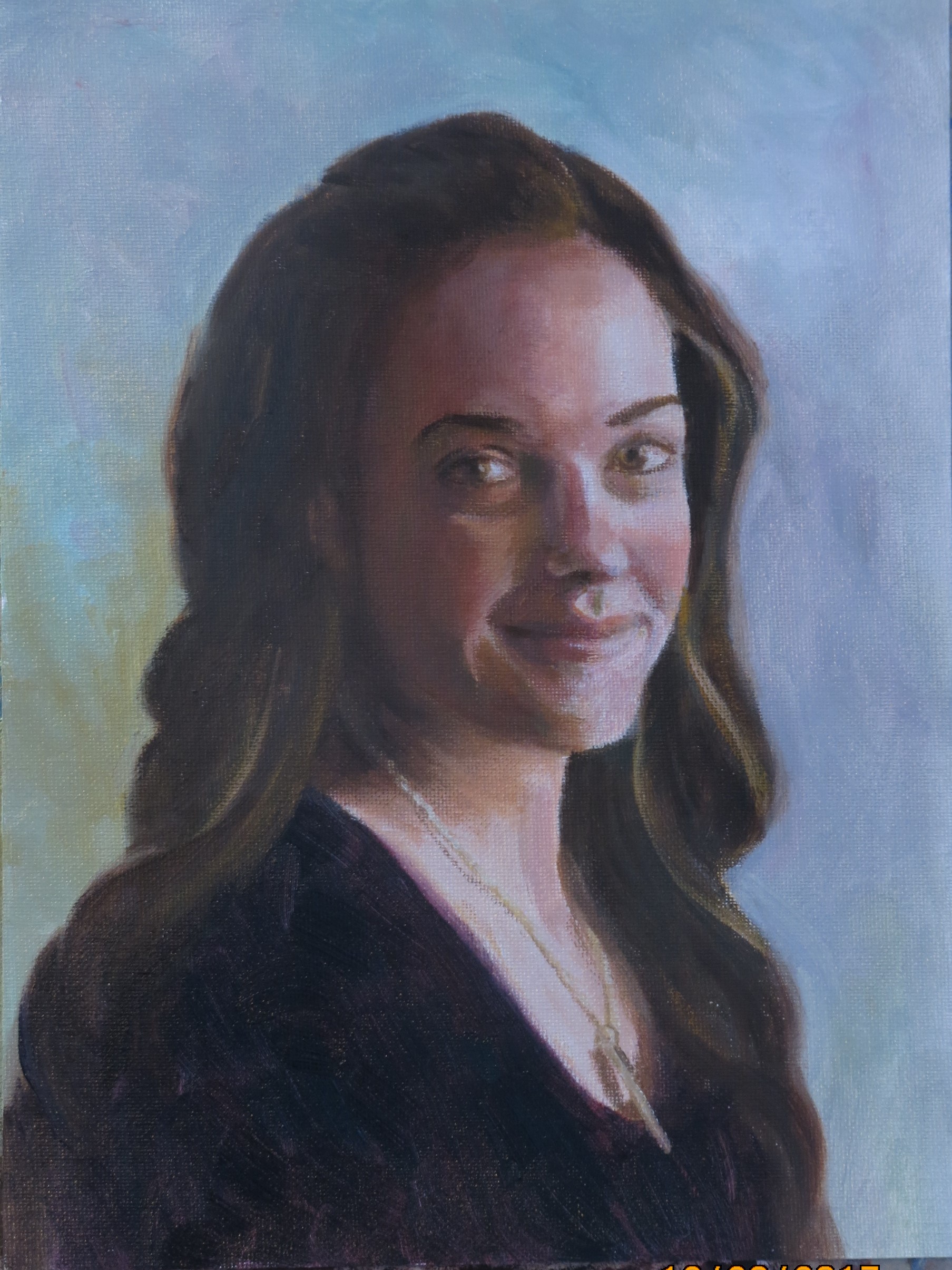
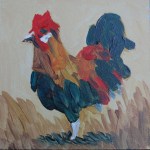
Finally finished! I feel my version looks a bit more intense than the original, maybe slightly more worried. The more I look at it, the more changes I see I could make to match the original more accurately. Whilst that seems to lead to a never-ending project, it is also one of the wonderful aspects of drawing or painting that I love; the more you look, the more you see, and you really come to know and appreciate that object in a different way than previously.

Portrait lesson II

She’s moved towards looking more life-like! We worked on shadows on the face and neck, the hair and the background. There is so much good information; the time is extremely enjoyable and just flies by!

One change I’ve made, following Kari’s example, is to start using a vertical palette. This is so the painting and the palette are seen in the same light, and to bring the paint colors closer to be judged more accurately. My vertical palette is actually just my horizontal Masterson palette mounted on an easel. The glass mixing plate is held in place by magnets; the magnets under the glass are glued to the palette. I like using it this way.

Lessons with Kari Rajkumar, Spring 2019

I’ve had the great pleasure of having four lessons with Kari Rajkumar, from Paris IL, this spring (Feb, March, May and June). She is an accomplished artist in oil portraits. I first saw her paintings on display in Terre Haute last fall and knew right away that I’d like to learn from her.

We decided to delay starting lessons until after Christmas. It worked out best for her to come to my home, which was very convenient for me! We worked on a copy of a portrait by John Singer Sargent, each working on our own painting. She instructed and described processes as we went along in the 3 hour lessons.

I learnt so much great information about oil paintings and portraits in particular. I also benefitted from applying those to my other paintings, which Kari would then critique for me. That was really helpful.

This was the progress after the first lesson. The lesson was mainly about facial structure, lighting and skin tones. Rather a ghostly look!

Happy Flowers

IMG_0098

Acrylic on canvas, 8 x 10

I painted these cheerful sunflowers recently from a tutorial by Sharon Hofer www.creatingamasterpiece.com after using her video instruction as a basis to teach 4 middle school students the same painting. I think it’s such a lovely painting I decided to have a go too! It was completed in about an hour. My daughter likes it so much she asked to have it hanging in her bedroom, which is where it now lives.

Sharon Hofer teaches good methods in a clear style, and I feel could help anyone develop their art. I was lent the hard copy video by a friend, although Sharon has now changed to a subscription system, which means a bit more capital outlay to access the information.

Skin tones in oil

IMG_0256 (2)

9 x 12 ins, canvas

In November I enlisted the help of this very gracious family member to help me follow the instructions of Brian Neher on the Craftsy video course ‘Painting Realistic Skin Tones in oil’.

We set her up near a North facing window, with a suitable background, and I took about 60 photos of her. Together we chose a few that we both liked and I settled on this pose.

The photo shows the colors a little incorrectly-the shadows are not quite that brown. However, I’m not satisfied with the shadow colors. I mixed cadmium red medium, yellow ochre, titanium white and a touch of viridian, aiming for grey, but the mix went more easily to a brown hue than a grey one. I need more practice and experimentation with this-does anyone have any tips?

I’m looking forward to trying the next one!


Learning Acrylics

I’m continuing to work through the 50 lessons in  Learn to Paint in Acrylics with 50 Small Paintings by Mark Daniel Nelson. I’m working on #32, and sometimes itching to branch off and do ‘my own thing’, but also wanting to complete all the exercises and learn as much as I can. I’m really enjoying the immediacy of the paint, and the way it forces me to be bold and unfussy. Each painting takes me about 30-60 minutes.

I’ve been experimenting with different brands and types of paint, but think I’d better stick to one for now and learn its characteristics, so I’m using Winsor & Newton Artist Acrylics. The consistency is between soft and heavy body, the colors are bright, and they claim that there is no color shift on drying and that they stay wet just a little longer on the canvas. I cannot see a color shift, but I’m not sure about the drying time, as I re-use my paints from a Masterson Sta-Wet palette, so they may already be slightly changed by the time I use them.

I’m also keeping up with my daily Art Journal in watercolor. Maybe that’s why my progress in the 50 acrylic paintings seems slower than I’d like.

Lessons in Acrylic

IMG_0304

I have been having great fun painting these 5 x 5 inch panels in acrylic, using the excellent instruction in this book, Learn to Paint in Acrylics with 50 Small Paintings, by Mark Daniel Nelson. I found the book at a local library, but have now bought my own copy.

I started out using small squares of canvas paper, but wanted something more solid, so I bought a 2 x 4 ft sheet of hardboard and Jim cut it into 5 inch squares for me. Then I coated 8 at a time with 2 coats of white gesso. The colors are so much fun to work with. I’m experimenting with different types and brands of paint, and even trying out a few mediums.

I’ve done the first 22 small squares in the book, each of which has it’s own ‘lesson’ featured. I’m excited about the possibilities!